


Nixie Digital - Wear OS Face
4.226.00 Reviews
App Specs
- Version
- Varies with Device
- Updated On
- License
- $1.00
- Downloads
- 10,000+
- Developer
- Inspire Watch
- Categories
- Personalization
- Platform
- Android
Screenshots
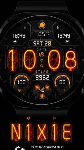
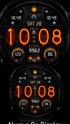
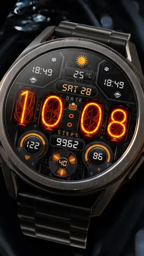
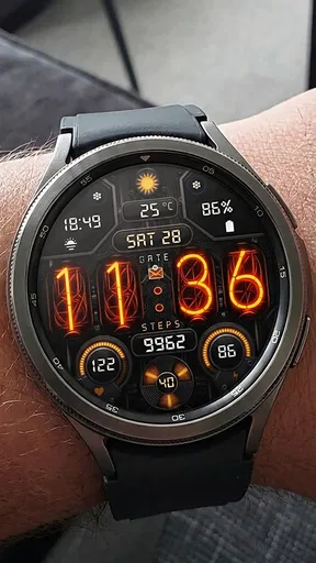
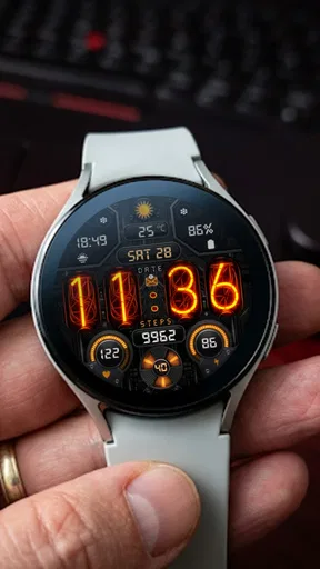
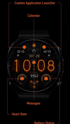
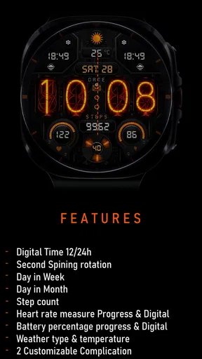
 Analysis by AppCompare
Nixie Digital - Wear OS Face takes a deliberately retro route to a modern smartwatch display. Instead of trying to show everything at once, it puts the digital time at the center and gives the watch a distinctive Nixie-inspired personality. I found it most appealing when I wanted my Galaxy Watch or Pixel Watch to feel less like a tiny phone and more like a carefully chosen accessory.
That focus is also the main reason to consider it. This is a paid personalization app from Inspire Watch, priced at $1.00, and its audience is quite specific: people using a compatible Galaxy Watch, Pixel Watch, or another device running Wear OS 5 or later who care about the look of the watch face as much as the information on it. It is not trying to replace a fitness dashboard or become a miniature productivity tool.
What the Nixie-inspired design gets right
The visual idea works because it is easy to understand at a glance. A Nixie-style digital display has more character than the standard numbers found on many preinstalled faces, but it remains practical. I can check the time without decoding decorative hands, waiting for a complicated animation, or searching through several small widgets.
That makes the face particularly comfortable in ordinary situations. When I am walking between meetings, cooking, or briefly checking my wrist while carrying something, a clear digital readout is usually more useful than a crowded layout. The retro treatment adds identity without changing the basic habit of reading the time.
The app sits in the personalization category, and that description matters. Its value is not measured by how many tasks it performs. The value comes from changing the emotional feel of the watch every time the screen wakes. A familiar device can feel noticeably more personal when its main screen has a strong visual theme.
I also like the restraint implied by the Nixie Digital concept. Many watch faces compete for attention with weather panels, activity rings, battery indicators, calendars, and multiple shortcuts. Those options can be useful, but they often make the display feel busy. This face is better suited to someone who wants the time to remain the obvious priority.
The store summary also points to health and weather information, which gives the design more practical reach than a purely decorative clock. In daily use, that combination is sensible: the time handles the immediate glance, while health and weather details help answer the two questions people commonly ask before leaving home or starting an activity.
Worth Reading Before You Choose

EA SPORTS FC Mobile 26 Is a Bigger Football Game, but It Takes Time

Flipboard Shows What News Apps Must Do Beyond the Feed

Switching to Android Auto Means Rethinking Your Driving Routine

Google Calendar Makes a Crowded Week Easier to Manage

Ludo King Makes the Most of the Minutes Between Plans

Baby Panda World Brings Quick Play to Modern Phones, but Its Game Library Feels Busy
There is a useful trade-off here. A watch face that presents only a few prominent elements can be easier to read outdoors or while moving, but it may require another tap or a separate app when I need deeper information. I see that as a design choice rather than a flaw, provided the user prefers clarity over density.
Why the health and weather angle matters
Health and weather are not equally important to every wearer, so I would judge the face by how those details fit into your routine. If you regularly check conditions before commuting, walking, or exercising, having relevant information near the time can reduce the need to open a separate screen. The benefit is small in any single glance, but it becomes noticeable across a full day.
For health-conscious users, the watch face can serve as a quiet reminder that the device is more than a clock. However, I would not choose it as a replacement for a dedicated workout view. A face is best at summarizing information, not at guiding a long exercise session or presenting every metric in depth.
One practical tip is to treat the main display as a decision screen. Before leaving, glance at the weather information and decide whether you need an extra layer or different footwear. During a busy day, use the time display for quick orientation and move to the watch’s dedicated health tools only when you actually need detail. That workflow keeps the face uncluttered while still making its supporting information useful.
The same principle applies to weather. A glanceable indication can be valuable, but weather changes and local conditions can be more complicated than a small watch display can show. I would use the face to decide whether to check further, not as the only source for a serious travel or outdoor plan.
Compatibility should be the first check
The biggest practical question is whether the watch meets the platform requirement. Nixie Digital is intended for Galaxy Watch, Pixel Watch, and Wear OS 5 or newer. That immediately narrows the audience, and it means I would check the operating system before thinking about the design.
This is especially important for someone moving between phones or watches. A face that looks perfect in the catalog is not useful if the target wearable cannot run it. I would confirm the exact watch model and its Wear OS version first, then make the purchase. That simple check avoids the most frustrating kind of personalization problem: paying for something that cannot become the active face.
The age rating is Everyone, which fits the nature of the product. There is no complicated subject matter involved; it is a straightforward clock and personalization choice. The more relevant question is not age, but whether the wearer values a stylized digital display over a larger collection of complications.
Inspire Watch has positioned the app as a focused design rather than a broad watch-face suite. I appreciate that clarity. It tells me to evaluate the individual look carefully instead of expecting a large theme library or an all-purpose control center.
How it compares with the usual alternatives
The obvious alternative is the watch face already installed on the device. Built-in faces often win on familiarity, system integration, and the ability to expose many kinds of information. They may also offer more choices without an extra purchase. If I want maximum customization or a dense overview of appointments, steps, battery status, and other items, a standard system face may be the smarter option.
Nixie Digital makes more sense when the built-in choices feel anonymous. Its advantage is not that it can do everything better; it is that it gives the watch a stronger visual point of view. The retro display can make a plain wearable feel intentional rather than merely configured.
Another alternative is a more information-heavy third-party face. Those designs are useful for users who want to see several metrics without opening anything. The cost is visual noise and, sometimes, a less relaxed glance. I would choose the busier option for training or workdays built around constant status checks, while I would choose this face for a cleaner everyday presentation.
There is also a difference between a decorative analog face and this digital approach. Analog designs can look elegant, but they demand a slightly different reading habit, especially when I need the exact minute quickly. Nixie Digital is the better fit for someone who wants immediate numeric clarity while still avoiding a generic digital layout.
A realistic day with the face
Imagine a weekday commute followed by an afternoon walk. In the morning, I check the time and the weather before leaving. I do not need a full forecast screen at that moment; I need a quick indication of whether the conditions deserve attention. Later, during the walk, the health information gives the watch a useful role without forcing the display to look like a laboratory panel.
At work, the retro styling becomes a small conversation starter, but it does not interfere with the basic task of checking the time. In the evening, the same face still feels appropriate because it is not tied to a single activity or an overly sporty visual language. That versatility is one of its strongest qualities.
The trade-off appears when I want more context. If I need detailed health history, a precise forecast, or a broader set of shortcuts, I have to move beyond the face itself. I consider that acceptable for a display designed around glanceability, but users who dislike switching screens may find it limiting.
The meaningful limitation: style comes before maximum information
The central weakness is not a technical defect I can point to; it is the unavoidable compromise of a focused design. A distinctive Nixie presentation occupies visual attention, and the more prominent the time becomes, the less room remains for secondary information. Anyone who expects a watch face to function as a complete dashboard may feel constrained.
That limitation becomes more noticeable on a smaller watch display. Even when supporting information is available, tiny details can be harder to read while moving or in difficult lighting. I would not buy this face expecting to replace every other glanceable screen on the watch.
The price is low at $1.00, but a paid face still deserves a clear purpose. For me, the purpose is the visual transformation and the balanced inclusion of health and weather details. If those elements do not matter to you, even a small purchase may feel unnecessary because the built-in options already tell the time.
Another point to consider is taste. Nixie styling is intentionally distinctive, not neutral. Some users will find it warm and characterful; others may see it as too retro or less polished than a minimalist modern face. I would look at the design for several days before deciding whether it matches your clothing, workplace, and general preference.
There is also a maintenance habit worth adopting: after installing any new face, spend a day checking how often you actually use its secondary information. If you repeatedly open separate health or weather screens, that tells you the face is serving mainly as a visual choice. That is perfectly valid, but it helps set realistic expectations about what you are buying.
Who should choose it
I would recommend Nixie Digital to a Wear OS user who wants a recognizable style, reads time more comfortably in digital form, and appreciates having health and weather information close at hand. It is especially suitable for someone who finds many modern watch faces too crowded or too interchangeable.
It also fits people who treat a smartwatch as part of their personal style. The face can work with casual clothing, office wear, and everyday errands because it is not locked into an aggressively athletic appearance. The retro influence gives it identity without turning the watch into a novelty item.
I would be more cautious about recommending it to athletes who need a full training dashboard, users who want extensive complication control, or anyone whose first priority is seeing as many metrics as possible without tapping. Those people may be happier with a system face or a more configurable information-first alternative.
It is also not the right choice for someone using a watch outside the supported Wear OS range. Compatibility is not a minor detail here; it determines whether the face belongs in your shortlist at all. Check the wearable before purchasing, particularly if you are unsure which software version it runs.
My verdict after weighing the trade-offs
Nixie Digital succeeds because it understands that a watch face does not need to be a dashboard to be useful. Its strongest quality is the balance between a memorable digital look and practical glanceable information. The health and weather focus gives the design everyday relevance, while the Nixie influence keeps it from feeling like another anonymous numeric clock.
Its weakness is equally clear: users who want maximum data density or deep customization should look elsewhere. The face asks you to prioritize a clean, characterful display and accept that detailed information may require another screen. I think that is a fair exchange, but only for the right audience.
With an average rating of 4.2 from around 150 ratings and more than 10K installs, it has already attracted a modest but clearly interested audience. Those figures suggest a focused personalization product rather than a universal must-have, which matches my experience of it.
At $1.00, I see it as an inexpensive way to give a compatible Wear OS watch a more personal identity. My recommendation is simple: choose it if the Nixie look immediately appeals to you and you prefer readable essentials over a wall of metrics. Skip it if your ideal watch face is a customizable control panel. For the former group, the strongest reason to install it is the combination of personality and quick everyday readability.
Pros
- Clean
- retro-inspired design that suits everyday wear.
- Readable time display at a quick glance.
- Works well with Wear OS customization options.
- Lightweight face keeps the watch interface uncluttered.
- Good choice for users who prefer a classic digital style.
Cons
- Some features may require an in-app purchase.
- Customization options can feel limited compared with premium faces.
- Battery impact may vary by watch model and settings.
- Not ideal for users seeking detailed fitness information.
- Compatibility may differ across Wear OS devices.
FAQs for Nixie Digital - Wear OS Face
What is Nixie Digital - Wear OS Face?
Nixie Digital - Wear OS Face is a customizable digital watch face designed for Wear OS smartwatches. It focuses on a clean, modern display that makes essential information easy to read at a glance. Depending on the supported version and watch model, it may offer options such as color adjustments, layout settings, complications, and different display configurations for personalizing the watch face.
Which smartwatches are compatible with Nixie Digital - Wear OS Face?
Compatibility depends on the version of Wear OS installed on your smartwatch and the requirements listed by the developer on Google Play. It is generally intended for Wear OS devices rather than older watches running proprietary operating systems. Before downloading, check the store listing and confirm that your specific watch model is supported, especially if you use a less common brand or an older Wear OS generation.
Can I customize the appearance and information shown on the watch face?
Nixie Digital - Wear OS Face is designed to provide personalization options, although the exact controls can vary by version and device. Users may be able to change colors, select display styles, and configure supported complications such as battery level, date, weather, activity data, or notifications. Available options can also depend on the capabilities of your smartwatch and the Wear OS version it uses.
Does Nixie Digital - Wear OS Face affect battery life?
As with any active watch face, Nixie Digital - Wear OS Face can have some effect on battery consumption. A simple digital design usually requires fewer resources than an animated or highly detailed face, but complications that update frequently, such as weather or fitness information, may use additional power. For better battery life, reduce unnecessary complications and avoid frequently changing visual settings.
Is Nixie Digital - Wear OS Face free to download and use?
The availability and pricing of Nixie Digital - Wear OS Face may depend on the current Google Play listing, region, and whether the developer offers optional premium features or purchases. Review the store page carefully before installing to see if the app is free, contains advertisements, or includes paid customization options. Also check the permissions requested and the refund information provided by Google Play.


